
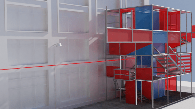
As a photographer, the concept of looking into a camera’s viewfinder has always been an interesting subject, playing with different angles, lighting, and running up levels to gain perspectives. When entering Fort Lane, we only have access to one perspective; the eye level, often looking upwards towards the red line that travels through the lane.

The definition of a folly is that of a structure with no designated purpose. Therefore, those who walk through the folly have the autonomy to decide how to occupy the space. Would they choose to sit and converse, or use it as a viewing platform overlooking Fort Lane?

I am creating a temporary folly, which is inspired by the camera, with a handful of playfulness. I specifically liked the concept of a pinhole camera obstructing the view, with a small opening directed at a specific subject. With this in mind, I curated certain viewpoints with red polycarbonate panels, arranged in a way that you may have to place yourself at specific positions to see these viewpoints. The overall structure will be created with scaffolding, to express the temporality of the design, and as a representation of Auckland as a developing city, a city with a permanent “construction in progress” sign.

Located in Fort Lane,my folly relocates down the lane over the period of 3 months in the summer. This is due to weather conditions, sunlight, and the higher desire to be outdoors exploring the urban.

Stage 1 will start in December, where the first iteration of the folly will be placed on the intersection of Fort Street. Small scale programmes may take place here. For example, it could be a place to sit, a viewing platform, and there is even a platform at the bottom that could be considered a stage for buskers.

Stage 2 will then move to Fort Lane, in front of Imperial Lane and The Jeffersons. The folly is designed in a way that it acts as extended entrances/exits to these places. The neon light in Fort Lane passes through this stage, so there is a gap that links the light and folly together.

Stage 3 will conclude by the Custom Street intersection, where it will consist of 4 levels, as well as the area above the store as an extension of the folly. The size of Stage 3 will be large enough to hold larger scale events with an elevator shaft in the middle for easier accessibility.

My site analysis was based on researching how light goes through Fort Lane, the points of interest that are present, and the levels of Fort Lane, including topography levels.


The origin of my design was based on my cinematic device in week 1, where I created filters in front of the lens, highlighting certain aspects of Fort Lane.

My process led me to create an abstract model which explores how light travels on surfaces when moving, and the projections it creates.

Feedback
Colour
- Could expand colour palette, such as red and blue = purple when overlapping
- Contrasting colours
- Experiment with different shades of red, instead of the default red
- Use the dropper tool from the model to get a palette
- Colour and lighting to indicate shifts, and colour merging
Lighting
- Daytime vs Nighttime comparison
- How lighting can be incorporated with the mixing of shades
- These surfaces are very vibrant and vaguely reflective, so add in a bit more red light surrounding them on other surfaces
- Consider the Eye Line Lane (red light) a bit more in your renders – potentially exaggerate the effect of this in the surrounding areas. Yana suggested the mixing of colours or tones with this. You could develop some interesting gradients of red with such a bright light, or some shades of purple, etc
Layout + Presentation
- Slide 5 is a bit dense with the grey background, you could potentially lighten this slightly?
- There seemed to be a slight inconsistency with the text in your plan views, so I would recommend some more uniform text across all images
- Your text sometimes takes up a bit too much room, or is placed in quite variable locations. Your text on slide 10 is quite elegantly implemented – could you make this more consistent across each slide? (There are some spots where the text is very close to the top border of the box, etc)
- Be sure to include dimensions for the plan images too
- The migration view/long section is fantastic. One small detail to add underneath each iteration of the design would be including the date of each stage
- The angles of slides 6 and 7 might benefit from being more axonometric/oblique views, like the angle seen in slide 8. I may have been misreading them but slides 6 and 7 seemed more like straight perspectives rather than parallel-angled views
Precedents to look into
- UNSTABLE, Pixel Cloud Installation
- Pompidou Centre
Experimenting with the feedback
Contrast in colours
I initially thought about using the colour green, as it is the complementary colour for red. However, mixing green + red = brown, and I wanted the colours to produce a more “effective” colour, so I decided to use two primary colours to achieve this. Therefore I settled with red + blue = purple.

I notice that the surrounding buildings during my site research were modern glassy/mirrored buildings, with blue tones. Therefore, blue was a stronger colour to use, as if the folly scaffold was “building” towards a newer, modern building.


I decided to experiment by replacing the mesh netting, particularly around the elevator shaft with blue polycarbonate panels, so that when you board the elevator, you get the perspective of red panels becoming purple as you go up/down the blue shaft. I believe this also adds more dimension to the colours in the design.
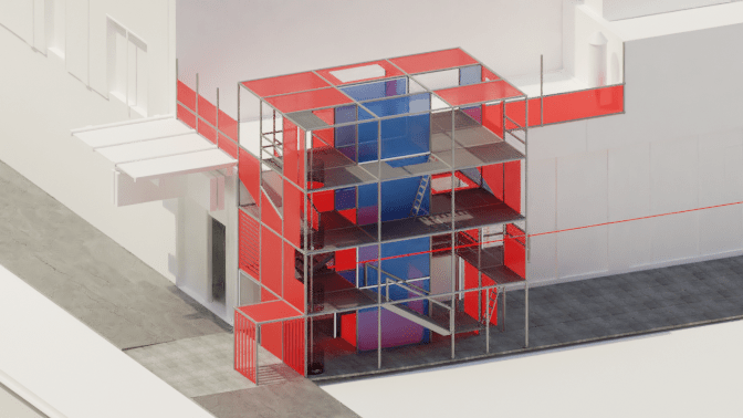


What stood out to me with making the elevator shaft blue was that it replicated the surrounding modern buildings in a sense, giving the illusion that the scaffolding folly was building towards the elevator, a modern structure. I was unsure about this feedback at first, but when experimenting I felt that it enhanced my concept even further, of Auckland becoming a developing city.
Shifting red tones
I tried experimenting with different shades of red, and I had noticed that the darker the red, the less vibrancy in projection (though this may be user program error). I did like the darker red, but was not sure if it would perform well in terms of lighting.
Darker red. less light projection 
Brighter red, more light projection
